Design

IOE 491 — UI/UX Design (class project)
Client
Improving User Experience of Zoom for Virtual College Education
Tools:
Figma
There were two objectives for this project:
- Identify and address inefficiencies in online learning faced by college students and faculty members.
- Improve Zoom’s satisfaction and usability ratings for students and faculty engaged in online learning.
The Design Process
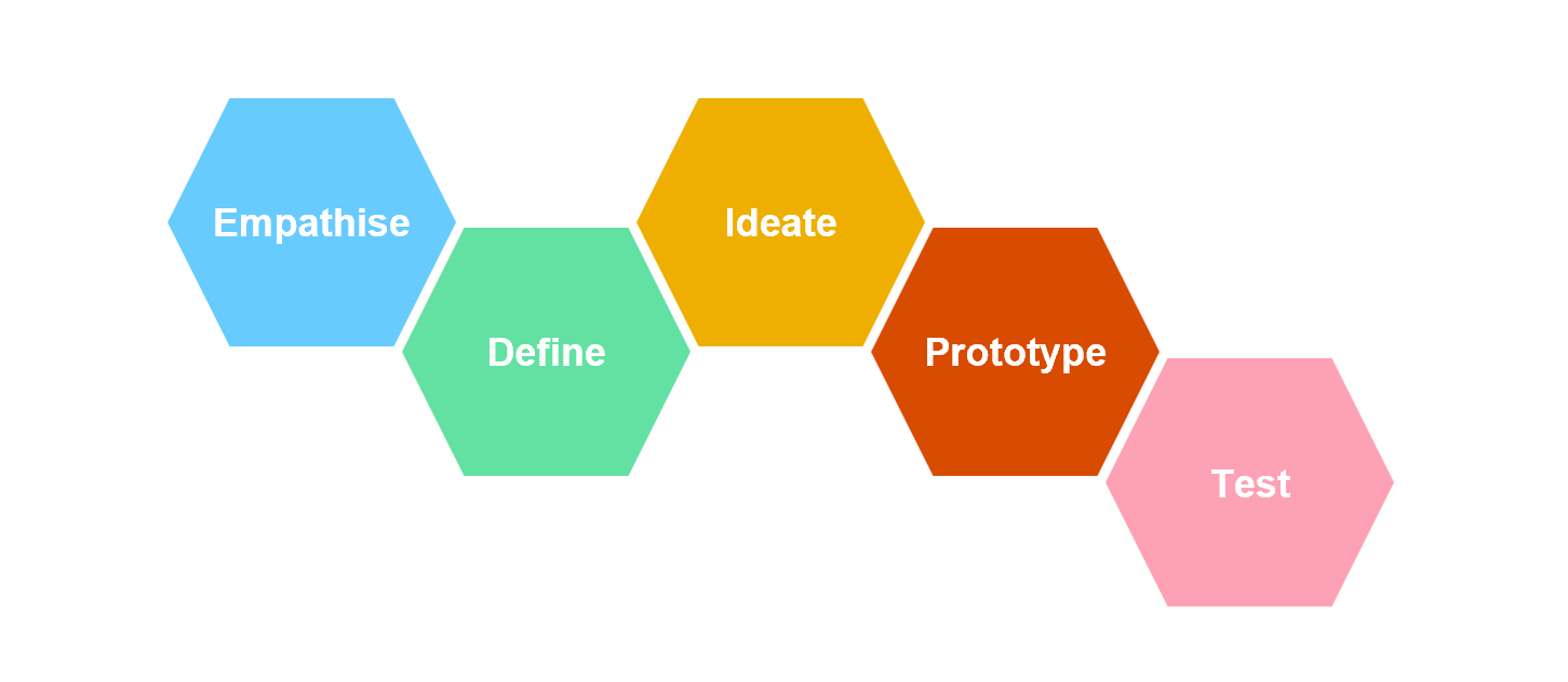
User Research:
- We conducted a survey with 75 respondents, interviewed 8 users, and conducted observations of 3 users while using Zoom.
Ideation:
- We reviewed current Zoom functionality.
- We conducted one 10 plus 10 ideation session.
Prototype and Test:
- We used sketches to develop our low-fidelity prototype and conducted expert evaluation.
- We used Figma to develop our high-fidelity prototype and conducted expert evaluation and system usability testing.
The user research resulted in the following findings:
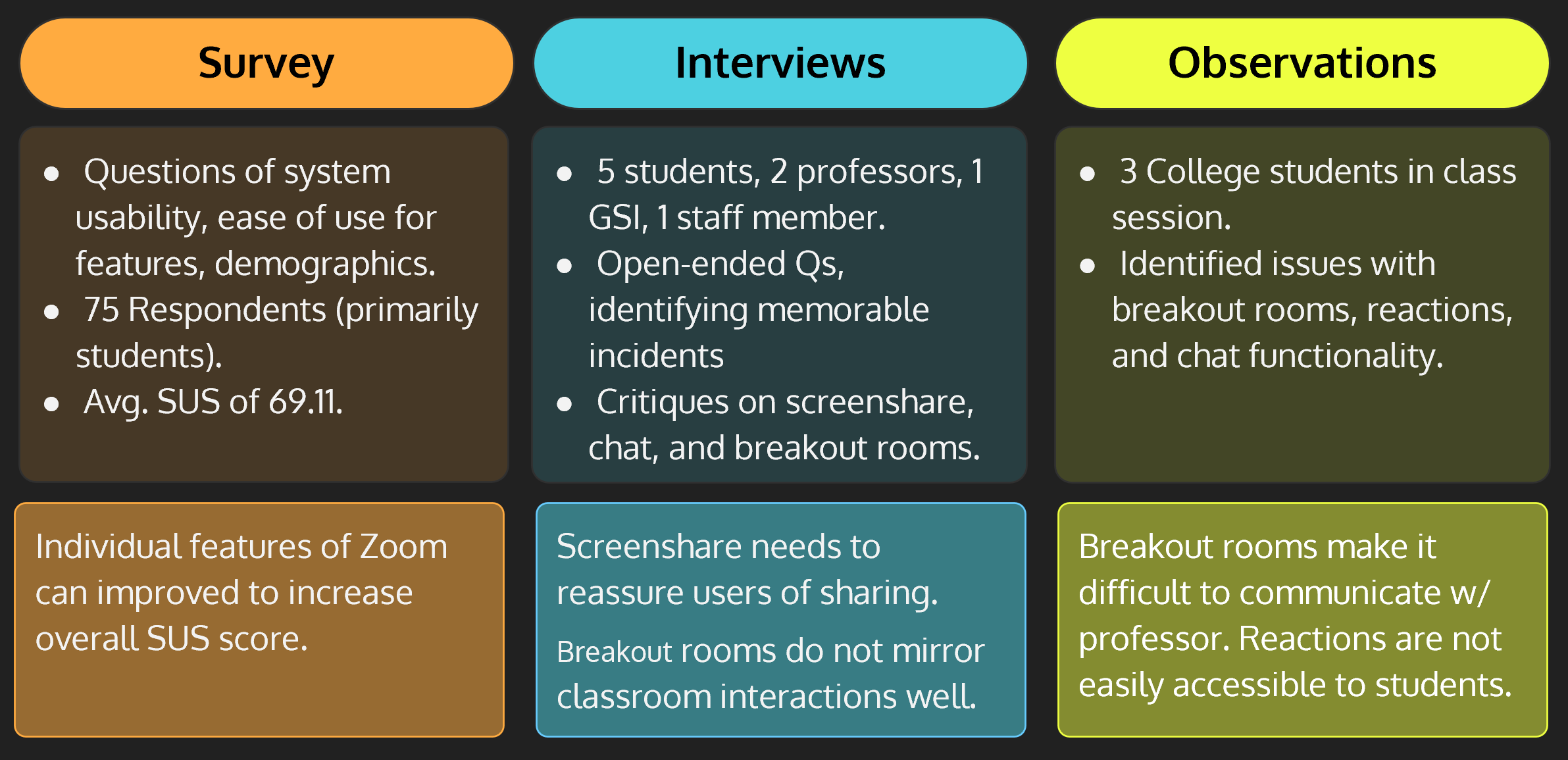
Based on the findings from user surveys and research, four Zoom functions were selected for redesign. These included chat, breakout rooms, screen sharing, and reactions. A 10 plus 10 ideation session was conducted to generate 16 different ideas for improving the design of these features. Four of these ideas were selected for creating both low and high fidelity mockups/prototypes:
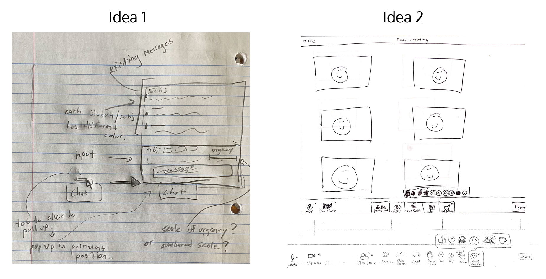
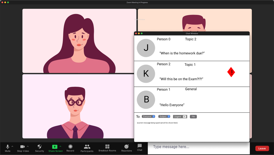
- Idea 1: Restructure chat functionality to include subject and priority tags and an improved notification system.
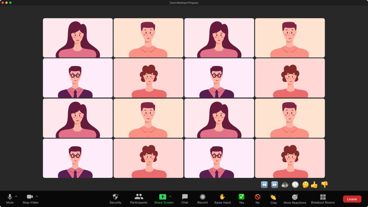
- Idea 2: Reorganize the menu bar to include one-click-access to all reactions, including the “raise-hand” function.
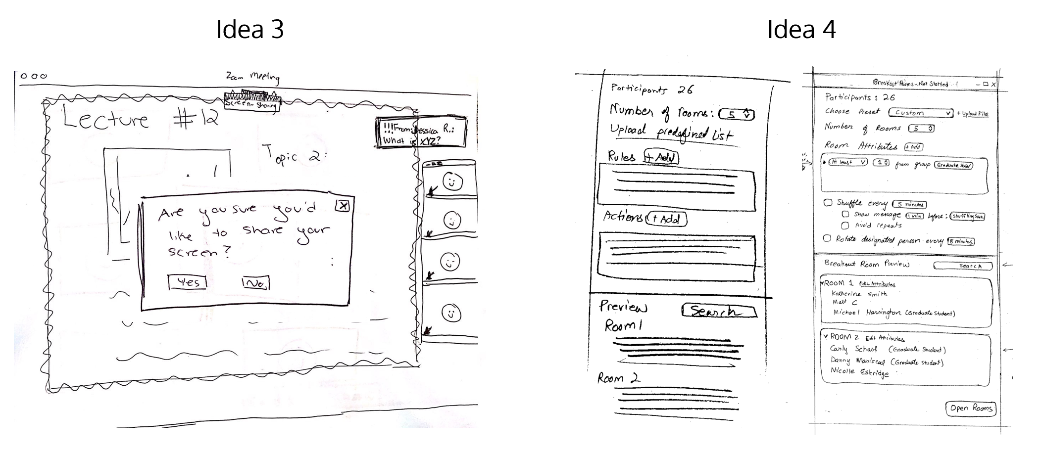
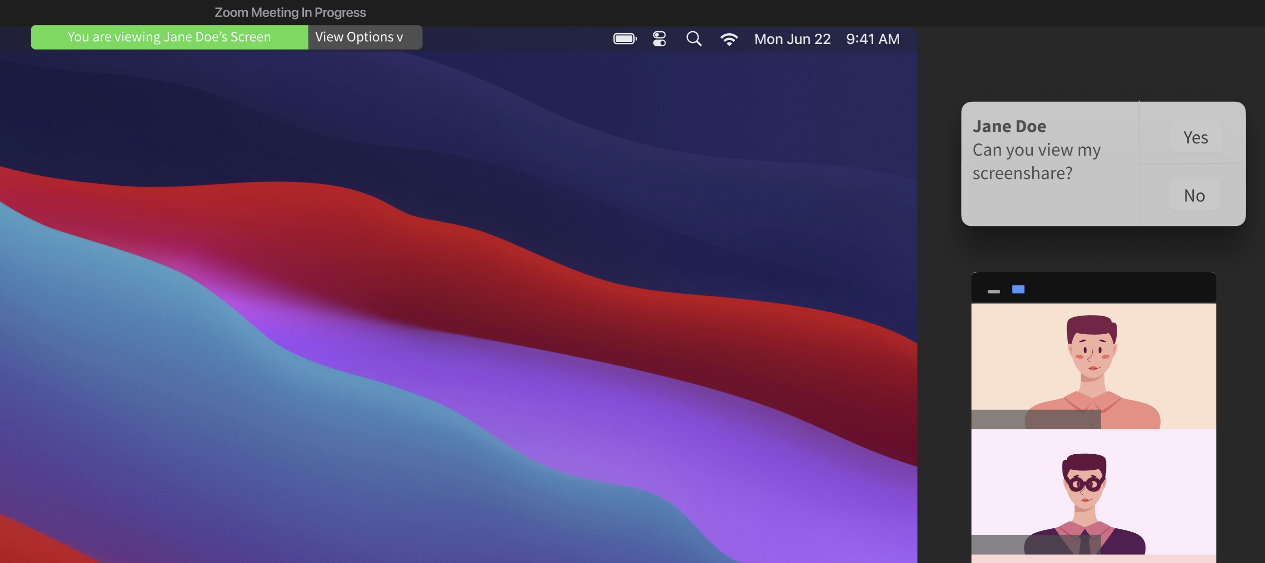
- Idea 3: Include pop-ups to confirm what is being shared and provide continuous feedback to users when screen-sharing.
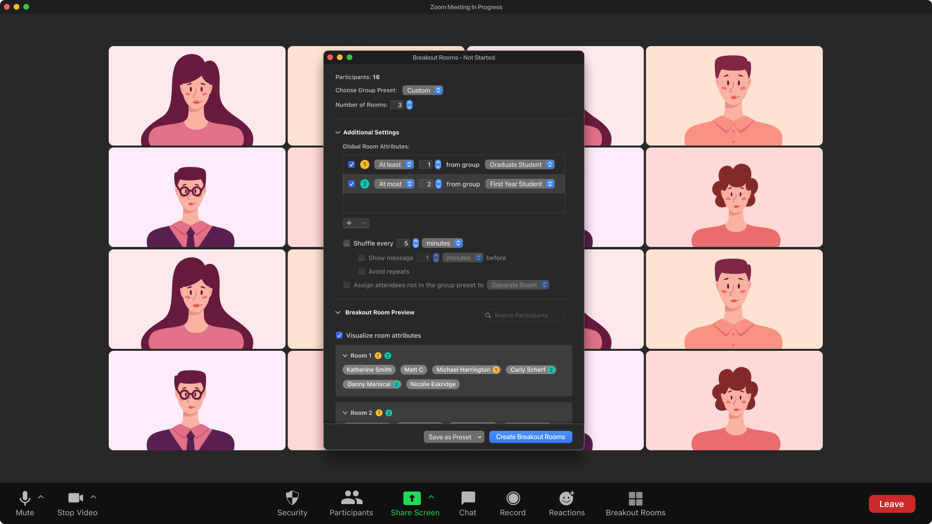
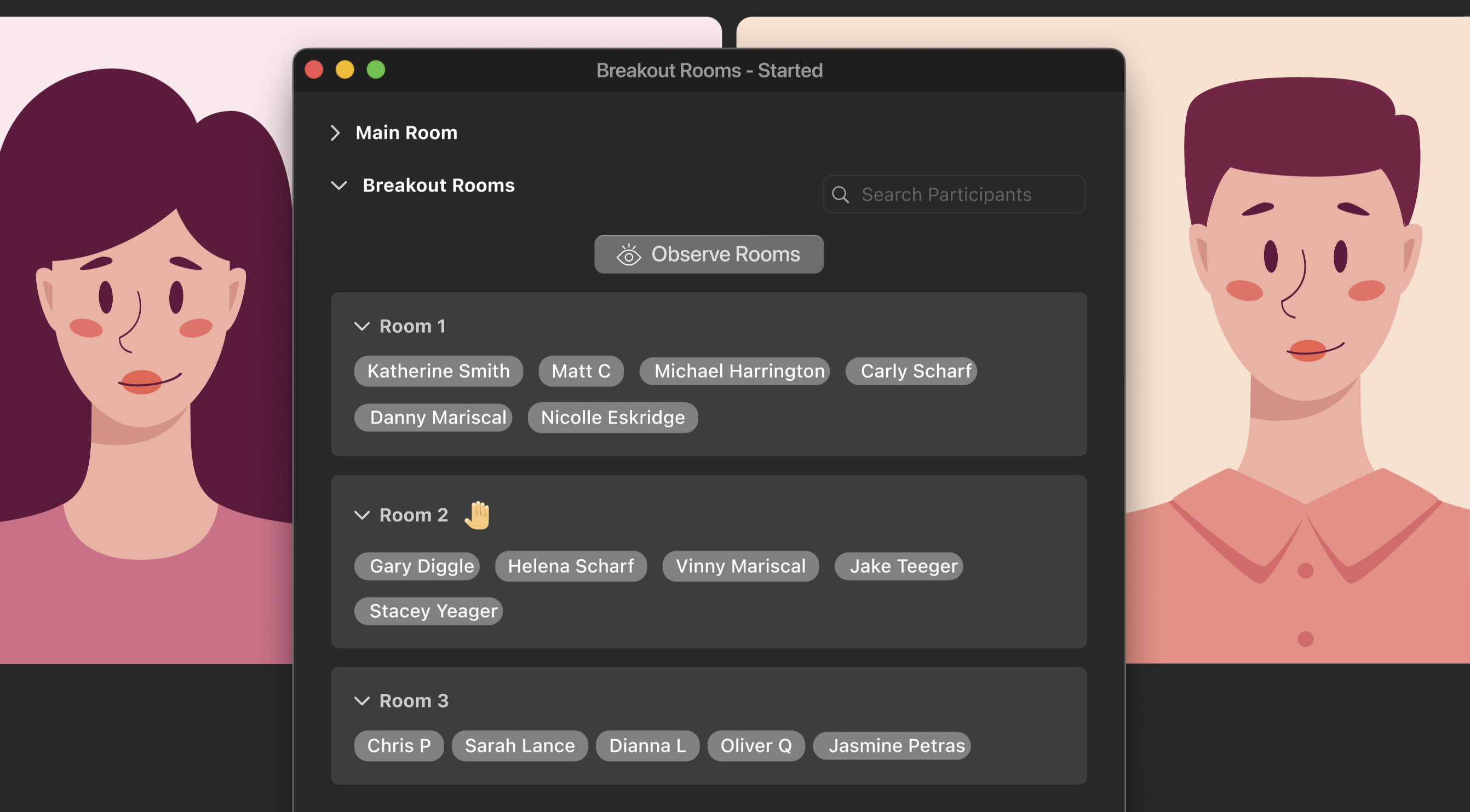
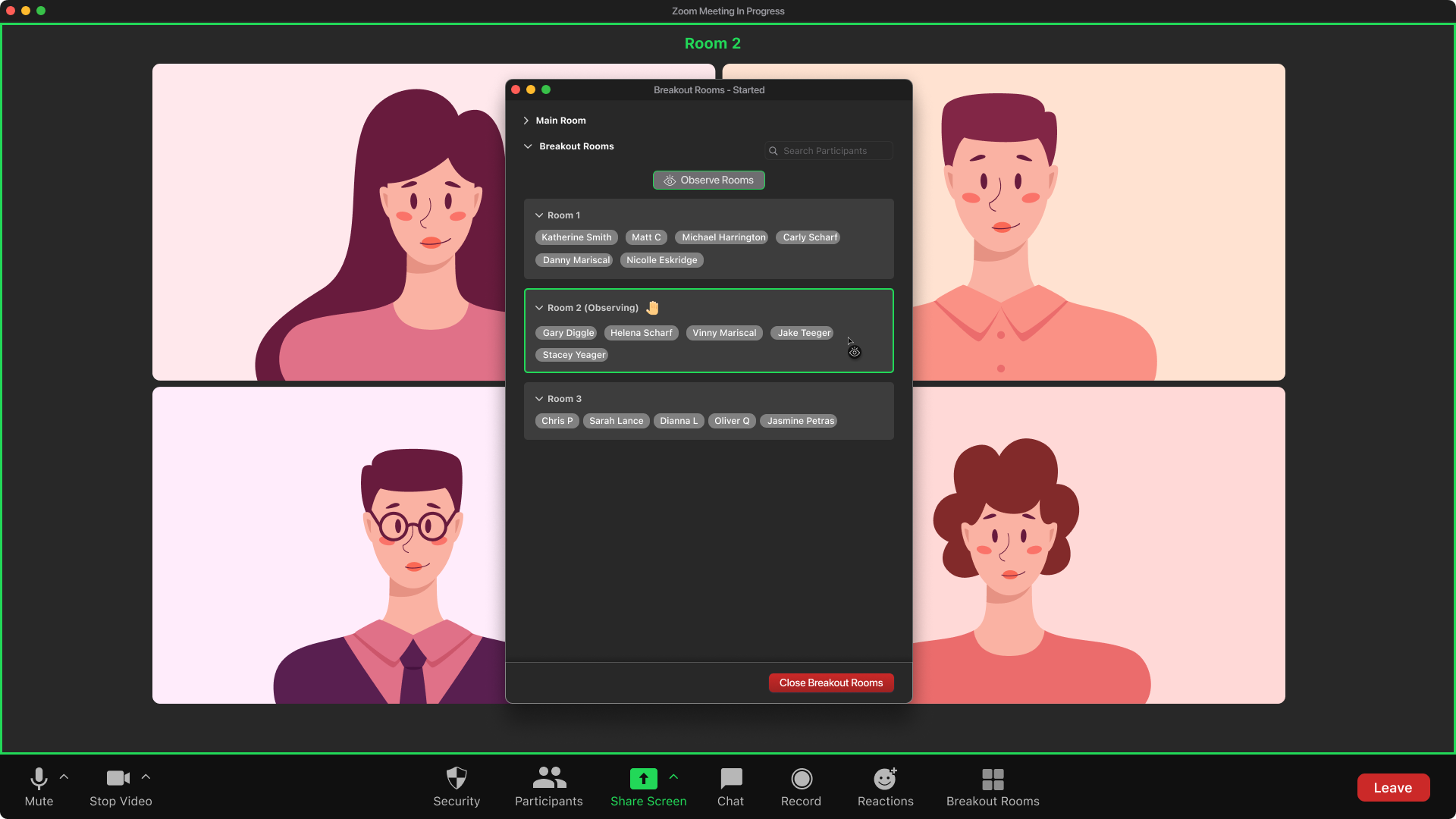
- Idea 4: Assign breakout rooms based on student attributes for easier grouping. Monitor breakout rooms easily without having to jump in and out.
Low-fidelity wireframes were sketched using pen and paper, and the high-fidelity prototypes were developed in Figma.
Low-fidelity wireframes
High-fidelity mockups
Idea 1: Redesigned chat box showing urgent messages and an ability to choose chat category.
Idea 2: Redesigned bottom menu provides one-click access to useful reactions, and an ability to bring up additional reactions.
Idea 3: Screenshare interface showing a request (on the right) from the presenter to confirm that the screenshared content is visible.
Idea 4: Attributes make it easy to automatically create breakout rooms with specified characteristics, such as having a minimum number of graduate students in each group.
Idea 4: Hosts can view reactions from each room.
Idea 4: Hosts can alo go into observation mode to easily interact with each breakout room by placing their mouse over the room name.
Project Outcome
- Identified and addressed the aspects of online learning through Zoom that were not working for students and faculty.
- Improved Zoom’s satisfaction and usability ratings.
- Interactive prototypes of the redesigned interface were tested with four users.
- Users gave the updated interface a score of 91.88 on the System Usability Scale.
- This score exceeds both the global avg. (68) and the initial usability score of Zoom from our user research (69.11).