Design

IOE 536 — Cognitive Ergonomics (class project)
Client
Eat Street Food Delivery Service Evaluation and Redesign
Tools:
AdobeXD
A heuristic evaluation was first conducted to better understand deficiencies and limitations of the EatStreet website and mobile apps. This was done by reviewing customer reviews/feedback, and by evaluating the website and phone app for violations of common design principles (e.g., Nielsen's heuristics, Shneiderman's design principles, Norman's gulf of execution, etc.). The heuristic evaluation revealed that the following design principle were violated:
- Knowledge in the world (e.g., lack of descriptions for menu items)
- Enable shortcuts (e.g., no way to save an order for future use)
- Minimize information access cost (e.g., no direct way to view restaurant ratings and reviews)
- Consistency (different information presented on the website and the phone app)
- Provide immediate feedback (e.g., allowing the user to select a menu item that cannot be delivered)
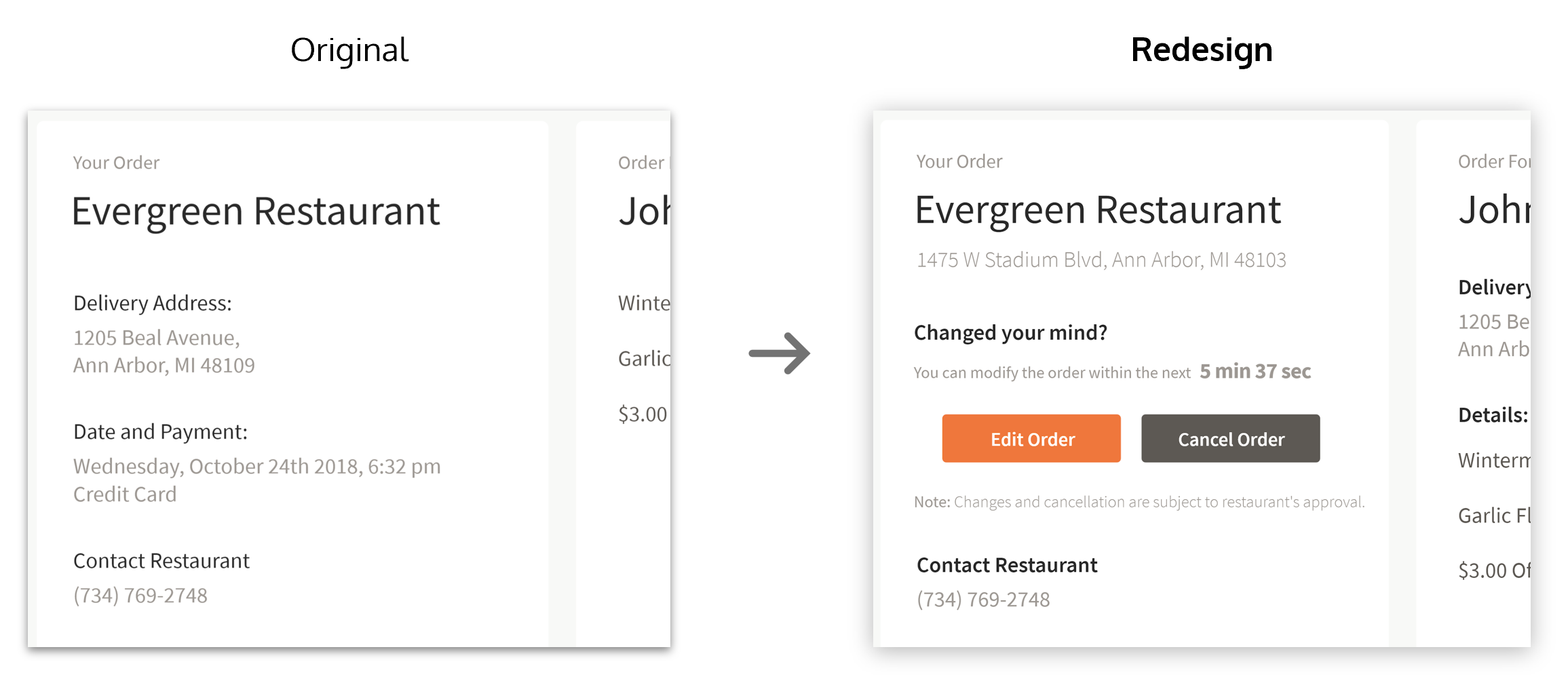
- Recognize, diagnose, & recover from errors (e.g., no ability to change an order once it is placed)
To further understand the users' pain points and limitations of the EatStreet services, a cognitive task analysis was conducted with five users. Each user was asked to complete the following three orders using the EatStreet web application:
- Order #1: delivery at 5 pm for a 2 topping pizza with lowest delivery fee
- Order #2: delivery for healthy vegetarian salad with low delivery and quick ETA
- Order #3: 5 pm takeout order for 2 topping pizza with 1 min. time constraint
While completing the assigned orders, each user was asked to think aloud as they completed each step, and a semi-structured interview was conducted to gain further insights after the completion of each order. The cognitive task analysis revealed the following issues:
- Difficulty in understanding delivery and takeout times contributed to errors in the sequence of ordering
- The meaning of some icons and symbols was not clear
- Filters were difficult to use
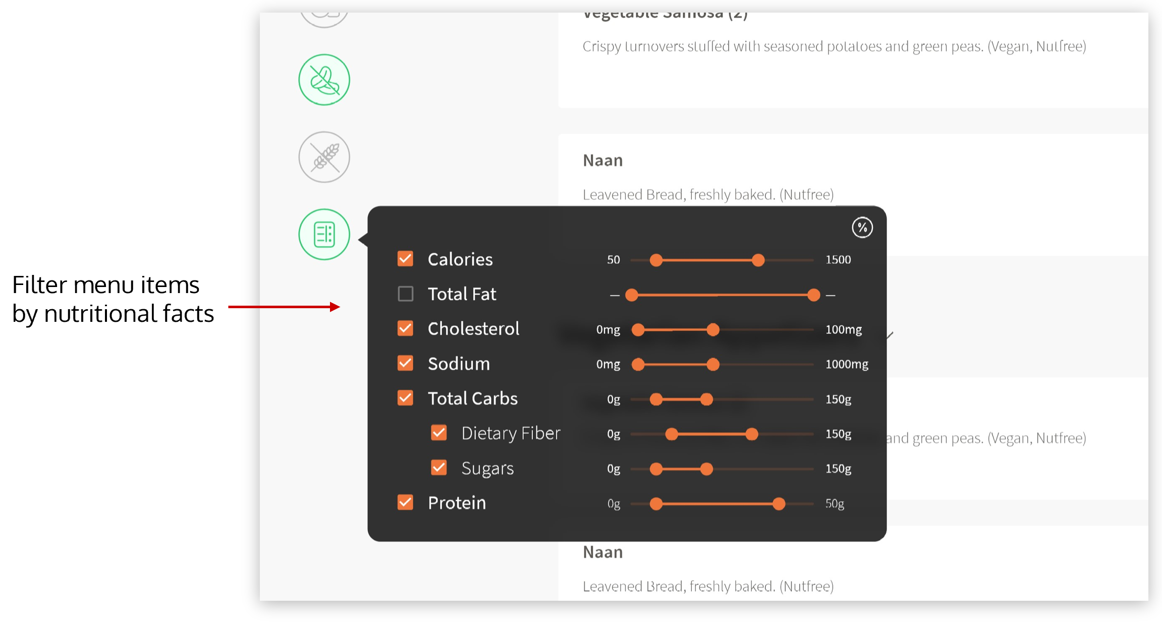
- Filters only apply to restaurant selection and not the menu items
- Long scrolling on restaurant menu page
Based on results from the heuristic evaluation and the cognitive task analysis, five key aspects were (re)designed and integrated into the EatStreet web and mobile user interfaces:
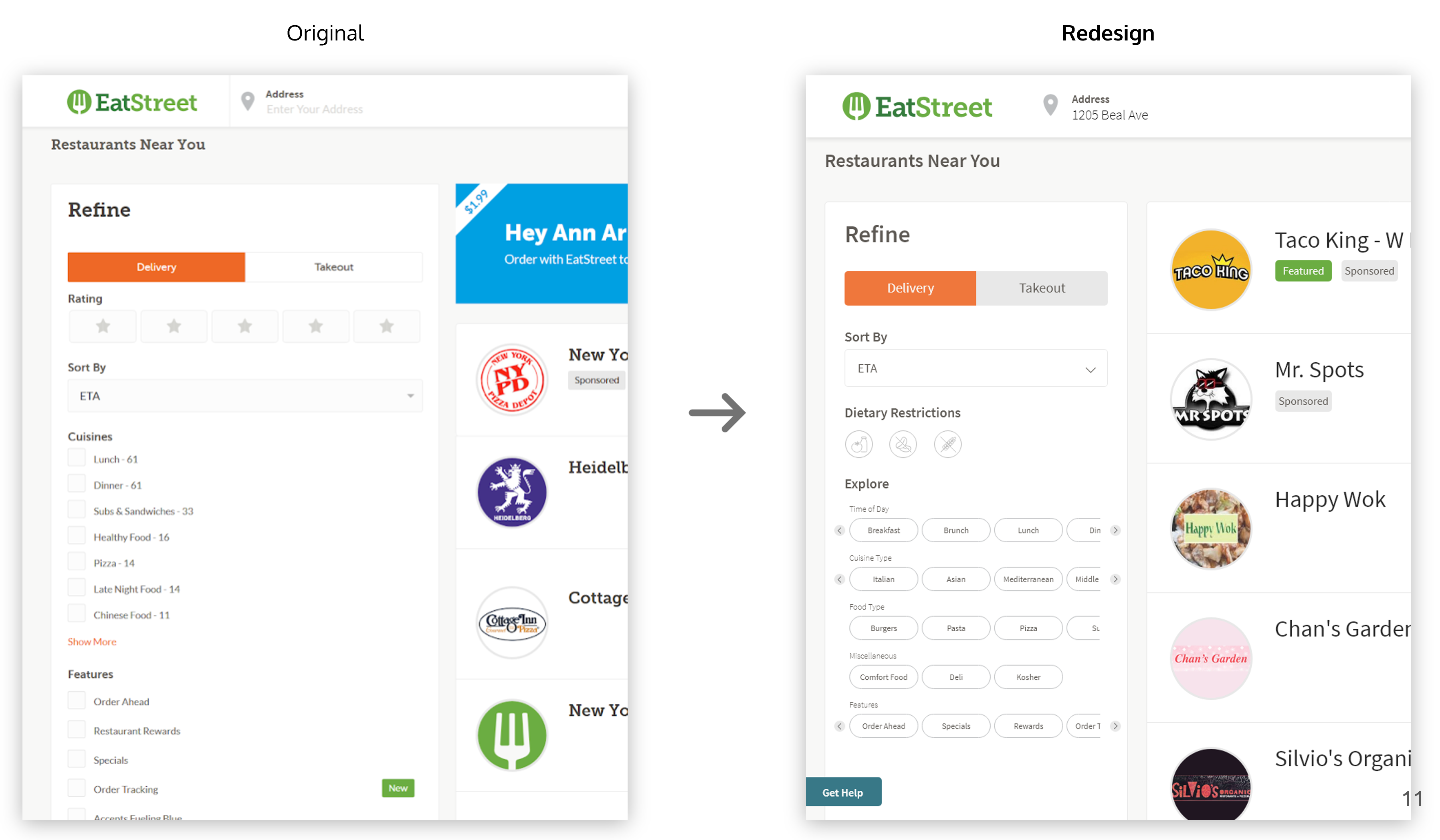
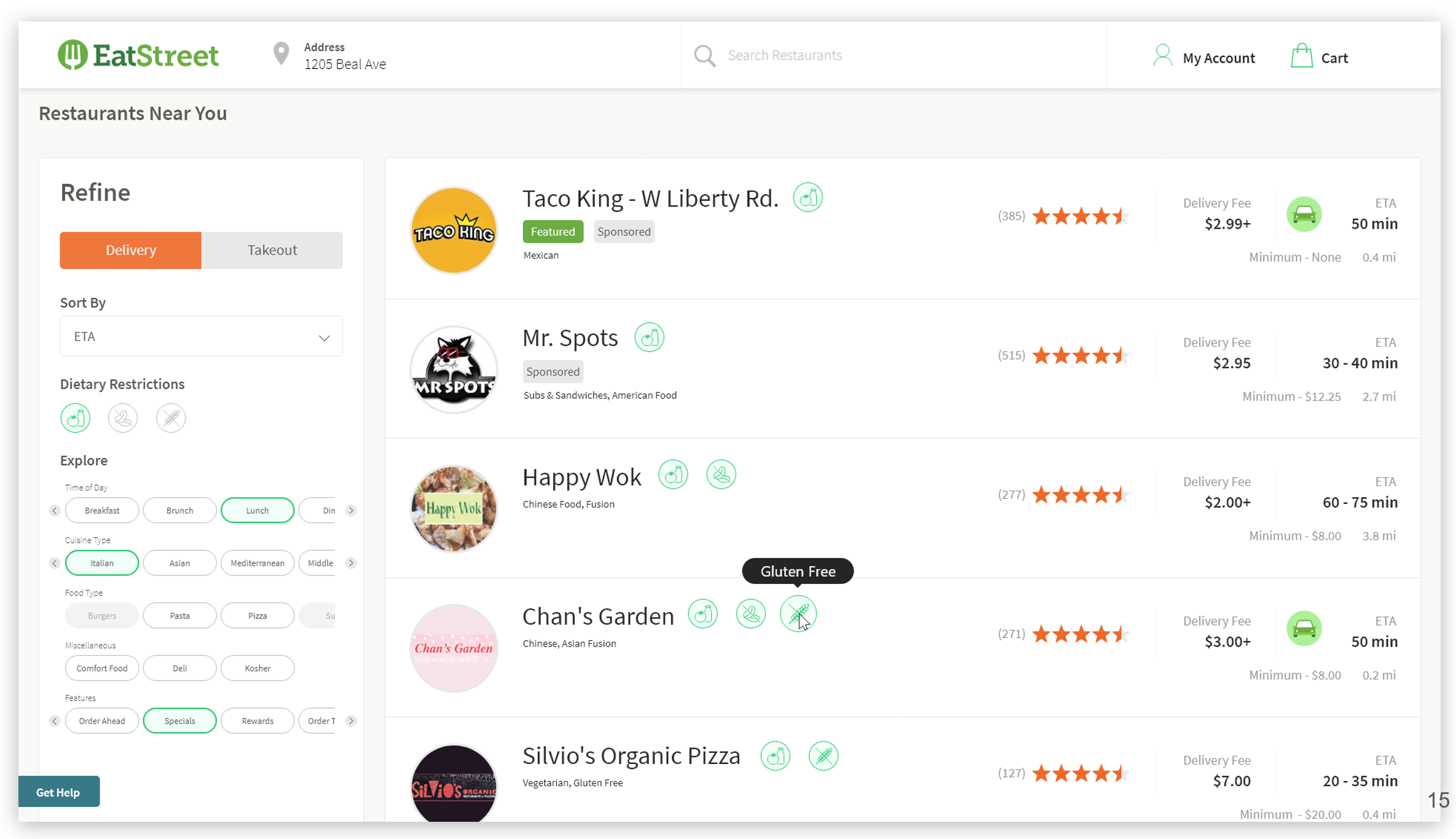
- Search filters
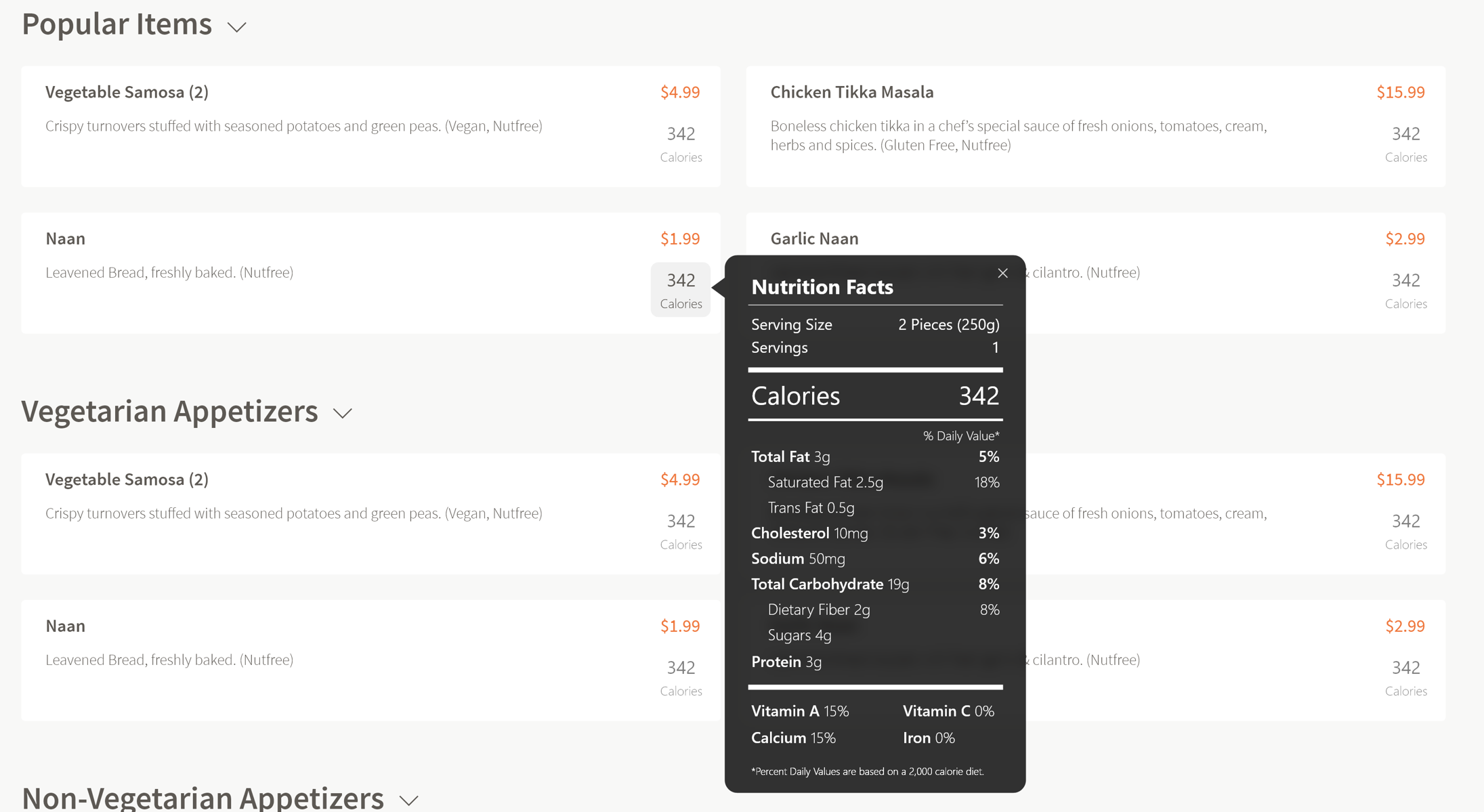
- Nutrition facts
- Limit need for srolling
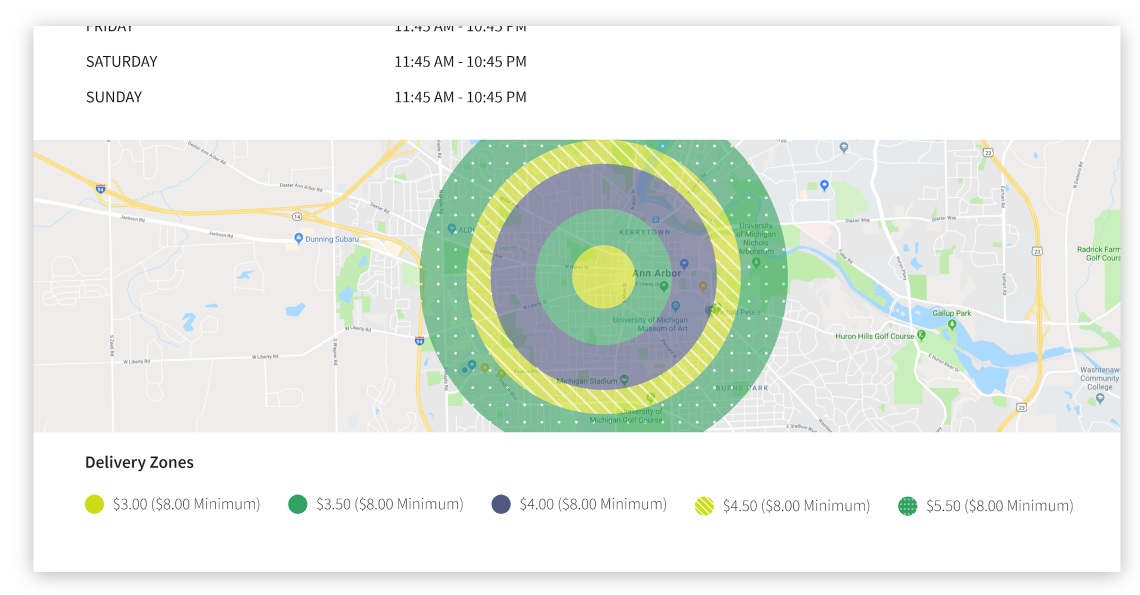
- Delivery range map
- Order summary and confirmation
The following mockups and interactive prototypes were generated in Adobe XD for each of the five key problem areas:
Search filters
Redesigned interface for search filters:
Interface with search filters applied. Note that each menu item shows applicable allergy and nutrition information:
Filters also allow for searching based on specific nutrition information:
Nutrition facts
Nutrition information is displayed for each menu item and can be expanded on click:
Limit need for scrolling
A horizontal menu was added to provide an overview of food categories:

Delivery range map
A colorblind friendly delivery range map was added to better indicate delivery fees and availability:
Order summary and confirmation
An edit button allows an order to be changed after being placed:
